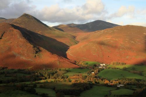
Jump to content

The changing face of Cumbria 1.0.0

   (4 reviews)

1 Screenshot

About This File

AV of Cumbria

Please let me know what you think of this show by using the "comments" feature.


What's New in Version 1.0.0

Released

Amended opening image. and now in MP4 format.

I would still love some more feedback, good or not so good, on this piece of work that took MANY hours of Photoshop work to achieve.


User Feedback

Join the conversation

You can post now and register later. If you have an account, sign in now to post with your account.

Guest

  • This will not be shown to other users.
  • Add a review...

    ×   Pasted as rich text.   Paste as plain text instead

      Only 75 emoji are allowed.

    ×   Your link has been automatically embedded.   Display as a link instead

    ×   Your previous content has been restored.   Clear editor

    ×   You cannot paste images directly. Upload or insert images from URL.

    Loading...

Beckham Digital

   1 of 1 member found this review helpful 1 / 1 member

Perhaps the reason few people comment on slideshows is cowardice and I include myself in that category too. Whoever makes the first comment, to some degree they set the scene and because no one likes to feel isolated or out of step,  there can be a tendency for others to follow the crowd. If the next views are contrary to those already expressed and perhaps not so positive, the pressure is strong to back away from making any comment, unless its positive.  Another issue is that to make really good comments, it  takes time.  Perhaps all it needs is one or two of us to step in and make honest comment and others may then follow.  However, what will kill this stone dead is what has been seen on forums like this (in the past, not now) and is rife on social media right now. A contrary opinion needs to be respected, but quite often it isn't and others then gang up on those who have made a comment they don't agree with.

My comments: This sequence is a pictorial slideshow and its pleasant to view. The music is fine and matches the pace nicely, but would I watch it again or recommend it? Probably not. The sequence depends primarily on the images, but in my view there are not enough of them and it leans too heavily on technique.  If your going to use Photoshop techniques, I want to see them a little better executed. I know you have to start somewhere, but what we can get away with in a single image is not quite the same as a sequence of images.

I don't see this show as being dominated by the third image. I feel its better described as a series of composites. The start of a slide show is where you set the scene for your audience, but here the first image is probably the worst in the sequence. The eye is drawn straight away to the bottom right corner, where there is a host of processing errors and they are isolated against black, which makes those errors stand out. If the viewer sees these issues in the first 3 images, it doesn't bode well for the rest of the show.  If we are not careful is can colour our judgement.

The impression I have is that you wanted to make a slideshow. but really didn't have quite enough images of sufficient variety and you turned to technique to stretch them out and (I've been there too) it hasn't worked that well in my view.  


Response from the author:

Thank for your comments Barry.

You are spot on about the first image, I think I will revisit that and change it but you are wrong about me not having enough images to make the sequence.

It was thought out from the start to constantly change only parts of each image to slowly form the next one, and so on. Any more images and the sequence would be too long.

Great to FINALLY get some dialogue going about this AV though. 

Link to review
Mickp

   1 of 1 member found this review helpful 1 / 1 member

Excellent use of image blending but for me it was a third image done to death. But great photography and good representation of the beautiful scenery in Cumbria.

Response from the author:

Thank you for commenting on my AV, I wish more people would give their honest opinions on all of the shows on here.

As for your comment about the overuse of "third images", this sequence is a constantly changing scene. There are only actually seven original images, taken by myself, all the other images are two originals blended together, in stages, using Photoshop. So in reality there aren't any "third images" at all.

Personally I can't get enough of the "third image", it is what I strive for in all my sequences, but it is always interesting to hear other people's opinions.

Link to review
Jim R

   1 of 1 member found this review helpful 1 / 1 member

Neat use of image blending! Nice work Tom

Link to review

I was interested in the show as I know the Lake District reasonably well and it was a change to see more of the high country. As a complete presentation I feel that it stands up pretty well, however there were some areas which I personally think could be improved.

1. The heavy black masking at the beginning and end was too heavy, maybe a vertical wipe form bottom to top at the beginning would work better and in reverse at the end.

2. As noted by another review the third image was maybe a little over used.

3. There is a distinct lack of sharpness in a few images.

4. Some Photoshop artefacts have crept in on a couple of images.

5. Generally the music was reasonable nothing really jarred with the images but towards the end the music got a bit more dramatic and would have suited an image of a waterfall or a a rocky dramatic landscape instead of a tranquil lake scene.

Please remember this is a personal impression of the show and maybe not everyone else will agree.

One final comment about using photoshop that I use when judging " I don't mind the use of Photoshop to enhance an image but I don't want to see obvious joins"


Regards John


PS. Have put this in as a review as there appeared to be no response to it in the comments section.

Link to review
×
×
  • Create New...